Graphis: Mayuki Ito
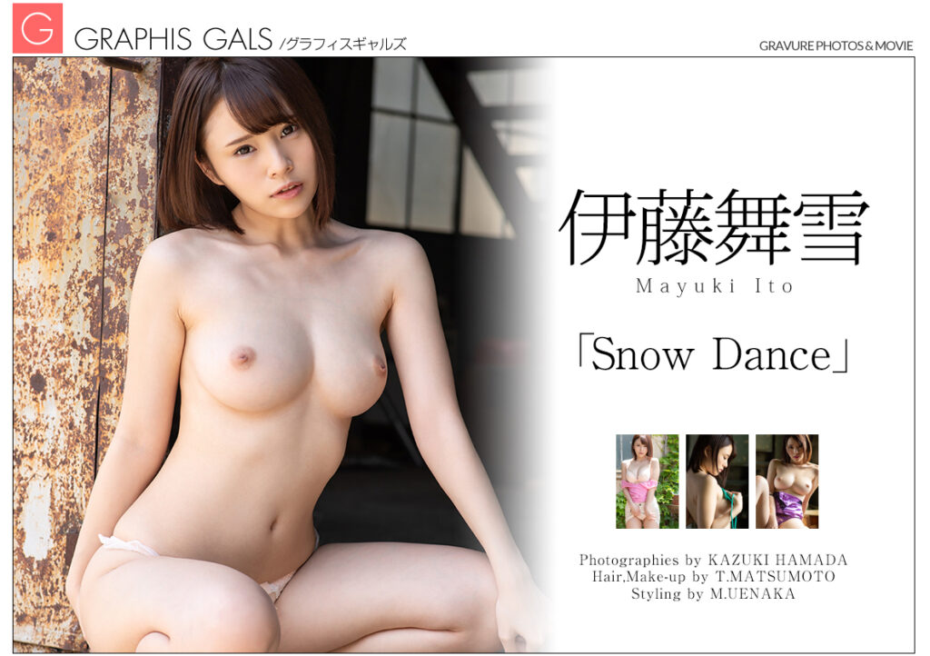
Actress: Mayuki Ito (20)
Studio: Graphis
Release Date: 2018-06-29
Runtime: 50 Minutes
Introduction
Production & Setting
The piano piece carries over with some changes in the next scene and we are now introduced to Mayuki standing in a sunlight doorway wearing Kasumi’s alternative attire from Dead or Alive. It’s vibrant and contrasts well, although the lighting can be a bit bright at times. However, a reposition fixes that as Mayuki takes to the floor for the rest of the scene. There is a sexy eating part in the middle of this shoot, i’m not a fan of these, but it’s there for those that are which is nice I suppose. After that is finished it resumes with the undressing and the final shots are well done showing the shadows created in the doorway adding depth to Mayuki’s nude figure.
The last scene is a BTS portion that is included in many Graphis shoots. It’s overlaid with a fairly casual musical track and shows how the scenes were shot, including those that did not get a video portion. It has cuts where Mayuki is asked questions and speaks to the viewer and camera crew. These additions are always nice and are more than welcome as far as I’m concerned.
Score: 8/10 (Production), 7.5/10 (Setting)


Music
Given the shortness of Graphis content there isn’t much to go over here. The music in each scene was good. For the first we were treated to a nice slower tempo piano piece that would not be a stranger in some sad scene in an anime. However, here it’s not really presented in a somber manner, more like one of being content. The music does take a more somber darker tone once the scene shifts to inside the building but the intent is to create the feeling of a mysterious and grand reveal, just without the crescendo that often accompanies such progressions. It is subdued by a lighter treble component, and once the clothing comes off, the music begins to fade away while still maintaining a feeling of awe and bewilderment at the individual present in the room.
The second scene has only one major thematic transition throughout, at first it’s more a peaceful track with some upbeat components that serve to compliment the outdoor aesthetic that Mayuki is working with. The next piece is similar tempo but more innocent in its tone. It projects a peaceful and calming tone. Once the last scene starts the music is in full grandeur mode. The instruments are loud, full, and there is a guitar solo that serves to introduce this final scene with Mayuki. It’s a little action-movie like but it’s ok. After it’s over the music moves down a few notches and takes on a more casual piece with a flute and light strums. It will carry on this way until Mayuki starts the food dessert play scene when it will cut out, returning as a guitar piece with accompanying instruments to show off the remainder of the scene. It carries a small hint of a somber tone but it’s largely overpowered by a more enthusiastic tone. The only issue with the music largely is that in some spots it cuts out and is silent for a second before it restarts.
The music during the BTS is a jazzy casual percussion solo piece that works with the whole video as it’s serving as a background beat for a montage and not necessarily trying to reflect the mood of a particular scene. There are other tracks in the BTS portion, some are more jazzy than others, but they all work.
Score: 7/10

Aesthetics & Performance
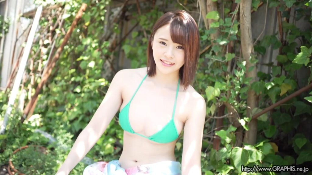
Performance wise Mayuki was good, she worked the scenes well and matched the music (granted this is up to the sound designers and they have to do the work of picking the right music to match Mayuki to a degree). There was not as much breast play in this “film” as there was in Mayuki’s prior Gravure title with REbecca, but perhaps that was the artistic direction that prevented that. Mayuki was cheerful in some shots, certainly enthusiastic during the BTS portion, and appropriately calm and collected during the less upbeat and more glamour like scenes.
Score: 8/10 (Aesthetics), 7.5/10 (Performance)

Photography
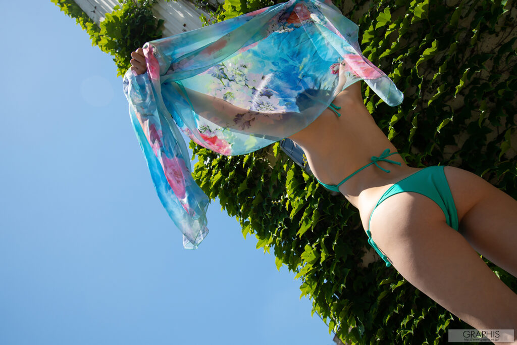
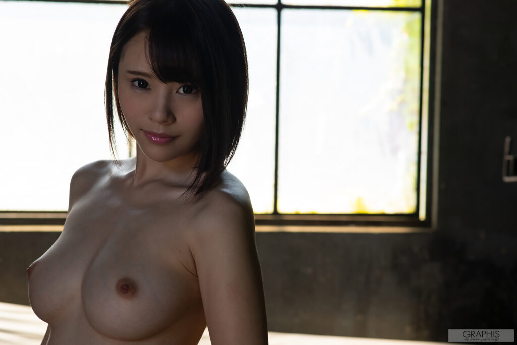
Left – To start we have an outdoor shoot featuring Mayuki in a summer dress and a bikini. This image is presented in an unusual manner, shot from behind and upwards, it aids in displaying the scale of the backdrop and Mayuki while at the same time providing a sense of being larger than life, akin to upward shots of athletes during dramatic montages and whatnot. Breaking down the various elements of the shot the first part we see is the dynamic color palette. Vibrant colors and two opposing yet cooperating gradients serve to add a multitude of depth to the shot. The green plants on the building exterior make the scene pop fidelity wise and are used to offset the palette created through the combination of the skybox and Mayuki’s dress, which is purposely positioned in a manner that allows the colors to bleed into each other in contrast to positioning the clothing solely within the frame of the plants, which would likely have subdued their effect. The clothing is also positioned in a way that provides a small amount of light to hit the side of Mayuki, this adds an additional element to the scene by adding depth and shadows, filling out the three dimensional characteristics of Mayuki’s clothing and hip. It’s done in a way that likely brings the viewers eyes straight to that spot as it contrasts with the rest of the scene.
Right – The second image focuses more on Mayuki, providing an angled head on shot for the viewer. Breaking it down, one of the more prominent and defining aspects of this image is the intent to display Mayuki off center with an out of focus backdrop. This serves a few purposes; the first to add depth and scale to the image by showing that Mayuki isn’t in a visual vacuum in a sense, and the other is to provide more lighting to create a greater shading gradient and add shadow elements to Mayuki’s features. This adds complexity and makes the image more dynamic. Focusing on Mayuki, her pose is off center so as to add a dimension to her characteristics. Her breasts become more prominent at an angle, allowing for size and shape to be observed, in addition, the added lighting effects help round out her body lines. The lighting compliments the scene in more than just added depth through shadows. Mayuki’s hair is darkened by the lack of direct light thus it adds a more muted tone which forces the hair to become more like a secondary element similar to the darkened walls in the surrounding backdrop. It also serves as a visual block of sorts to prevent the scene from being too noisy through the presence of excessive natural lighting. The is enough hair that it likely draws the viewer straight to that portion which then allows them to focus on Mayuki without being distracted by the secondary features. Lastly, we come to Mayuki’s face. This scene is not shot in a manner that evokes some lighthearted or energetic feeling, thus the expression displayed by Mayuki is more in line with a confident yet alluring image. Mayuki is naturally cute so that element will always be there, but the focus appears to be more bold and less playful.
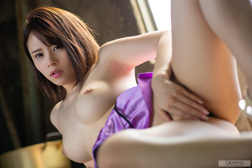
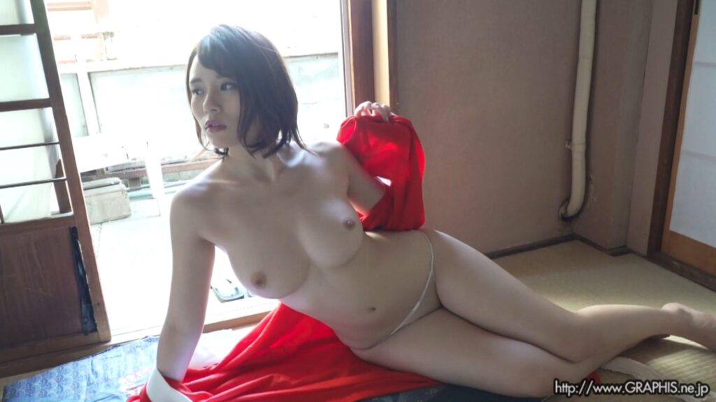
Left – Another angled front facing image, but in contrast to the darker image prior, this one is quite bright and brings with it some more complexity due to the varied focus depending on the position of Mayuki. Beginning with the backdrop, it is shot out of focus as is often the case when the model is meant to be the main focus, but it does serve to provide scale via the walls and natural lighting through the window, which has the added impact of not only brightening the scene, but also adding shadows and shading gradients to Mayuki’s body as evident by the shadows under her left arm and partially highlighting her left breast as the light is refocused on that portion. Moving to Mayuki herself, her pose is at least implying a more sexual pose as she is laying on her side and holding herself up enough to create something of a natural flow. Moving upwards from the bottom right of the image where the focus is faded, and her vagina is covered to her breasts and face which are the main star so to speak. The added color of her dress serves two purposes, the first is to add additional depth and context to the shot, the second is to serve as a break in similar color palettes so as to not be overblown with a single visual theme. As for Mayuki’s face and head, the lighting is positioned in a manner that allows more detail to be seen from her hair and brings out her color and texture to supplement the surrounding environment. Her facial expression is less of a charming confidence as seen in the prior and more in line with a sensual or vulnerable display. It can be taken as either, but both can be viewed as a positive emotive display depending on the context of the image.
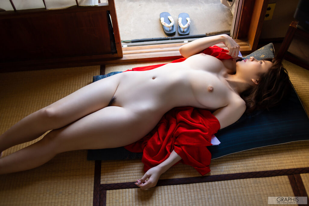
Right – The last image is a wider shot serving to showcase most of Mayuki’s body in all it’s pale glory. There are many elements serving to complement and contrast each other in this shot. First off we have a similar usage of using natural lighting from a specific angle in the background to add not only light to the scene but to add dynamic shadows to amplify the details in the shot, especially those of Mayuki where we see body lines being more defined around her waist, legs, and around her neck and breasts. Having the door partially open also allows the light to be focused more onto Mayuki and less so throughout the entire room, this is also a benefit in adding trailing shadows in the background on either side of the opening as it darkens those areas to aid in bringing more focus on Mayuki. Mayuki’s body is particularly pale in tone and the added touch of showing her pubic hair does serve a similar purpose as the shadows in breaking up the white canvas so to speak and adding some details to draw it out more. The vibrant colors of her dress, the mattress, and the sandals outside all serve as set pieces that draw attention to Mayuki since she is the odd one out from a palette perspective. Her pose is effectively serving to show the camera or the viewer all that she has to offer, and it works really well. Her gaze out into the world could be interpreted in a million different ways but for the purposes of categorizing it within an aesthetic framework, having her looking off to the side frees the viewer from focusing on her facial expression and more on her body and the surrounding elements.
Summary
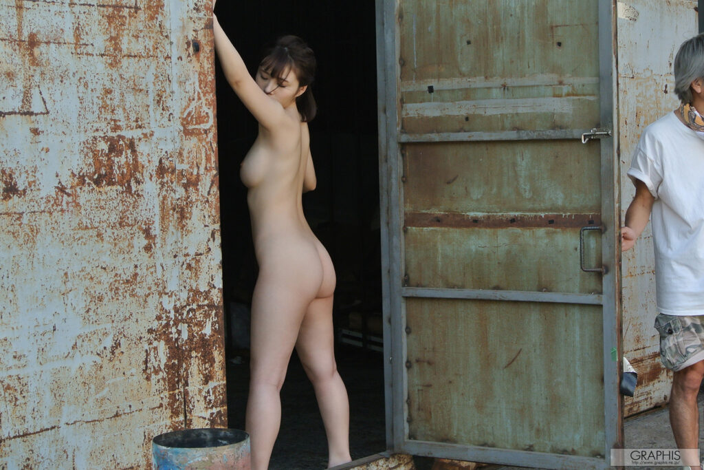
Mayuki’s performance is less active than in her full length productions from REbecca and other studios, and that is likely due to the nature of the producers. Graphis is primarily a photoshoot Gravure producer. They do videos but more often than not the content they release on the video front are short video versions of photoshoots, or teaser clips of longer length productions (and can often have scenes or shots that the other productions don’t have). This is not a bad thing, it just means that one should be seeking out Graphis content for their photoshoots and less so about their videos, with the exception of when the content is in addition to a bigger production from the likes of REbecca, for which Graphis is known to collaborate with. Overall, the scenes were good, top tier visual quality and music was well done as well in most respects. The scope of the content however is just short. However, extra points goes to the inclusion of BTS content, something that is still somewhat hit and miss amongst many Gravure producers, and they are a welcome addition that serves to add more depth to the model people are paying to see. It makes them appear more like a person and less like eye candy, which is a good thing in my book.
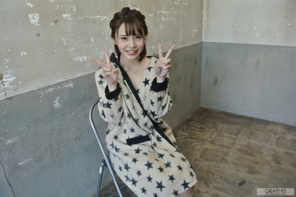
This photoshoot represented the debut of Mayuki Ito with Graphis, and to earn a full release is not something to scoff at in terms of Gravure publicity. In terms of the photoshoot, the settings were varied and offered substantial thematic lighting and environmental changes to make each shoot unique in its presentation as a singular item as a piece of the entire production. Mayuki was able to demonstrate a variety of expressions and visual queues based on well chosen outfits and poses. Kazuki Hamada is an excellent Gravure photographer with Graphis and the usage of soft lighting and shadows to compliment the figure of the model is something he is very familiar with based on his past works. There was one shoot with a darker lighting scheme and some reflective elements via Mayuki’s outfit done in this shoot, it was not reviewed in an effort to maintain a balance in review samples used, but it was done well with a large focus on shadows to draw out the model for the viewer. Overall, a great shoot.
Score: 7.6/10 (Video), 8/10 (Photo)
Pros
– It’s Mayuki, entertaining and cute
– Solid package overall
– BTS content (with music overlay)
– Photoshoots are of great quality with a good mix of different environments and visually aesthetic shots. (Photography Review)
Cons
– Short, but that’s generally how Graphis shoots are
– Not all Graphis shoots get film portions as evident by missing parts in this film vs what is shown in photos.
