Graphis: RION

Actress: RION (23)
Studio: Graphis
Release Date: 2017-12-08
Video Runtime: 16 Minutes
Introduction
I don’t even need to introduce RION at this point. However, I will announce a rework of the Photography reviews going forward. Given that these reviews focus on Graphis productions, and the majority often have very short video segments, either due to being alternate cuts of a full release or just being short teasers with BTS, the weight of an entire review being dedicated to them seems a little unfair. This will be a test review of sorts, with the video portion taking more of a backseat. As a result, the music section will be scrapped, with music referenced in the summary portion if it happens to be good or not. The remaining sections will be adapted to better suit photography vs videography including a separation between portrait and landscape photos as they bring about their own unique elements that should be addressed.
With that out of the way, on to RION’s second photoshoot with Graphis.
Production
Landscape Photos
One of the new sections going forward for future photography reviews is a separation and inclusion of both landscape and portrait framed photos. This is a test to see if such a format works. Landscape and portrait photos have their own artistic elements and mechanics involved that make the application of different visual elements worth consideration for review. The landscape section will (when applicable) consist of eight photos selected that best represent the intended theme and its respective elements. The portrait section will consist of four taken from select shoots, with photoshoot size determining if are chosen in future reviews. Now let’s get on with the review.


Left – Starting off we are introduced to Rion with an outdoor shot that utilizes the rule of thirds, a principle in photography that is meant to create a more energetic photograph by expanding the surrounding and contextual elements while still highlighting the main object of focus. In this shot we have Rion fully undressed while motioning her dress in a cap like manner, so it adds more depth through floating in the wind. On the note of the dress, there are earlier shots which feature the article, and it is a very interesting one-piece ensemble with a very colorful floral pattern, which because of being moved through the air the sunlight creates an additional layer of color that pops in an otherwise empty skybox. Speaking of the background, the skybox is very well presented. The blue isn’t overcorrected with saturation due to the blow out from the sun, and the sun being nearly center frame allows for a beautiful layering of shadows along the grass and a light aura on Rion’s right side. The flora is well saturated to highlight the differences between the blue sky and itself. With regards to Rion, her pose as previously stated works well with creating more depth to the image, and her body of course is always a welcome sight to see. A good introductory set, albeit quite short.
Right – This next shot is from the first indoor set. Featuring Rion semi-nude and sitting on the ground, this shot is a bit more intimate given the smaller frame for the shot. Rion is the central focus here; the backdrop is largely providing a color palette that meshes well with Rion’s hair color and the drapes work with the pattern on her panties. Lighting isn’t noisy and well balanced, with the lower position reducing the impact from outside sources. There is enough lighting to highlight Rion’s chest and to create a softer gradient along her legs as the shadow crease is not nearly as firm. The color saturation throughout the shot is neutral, nothing is blown out contrast wise. Rion’s panties have a soft pink color and a light reflection effect from the lighting. The drapes in the background aren’t bright, and the brown furniture and walls complement the image by creating a richer visual, especially once thrown up against a two-tone pattern in the form of Rion’s hair. While difficult to see at such a scale on the website, the photo also pays extra attention to skin complexion and details, creating plenty of detail around Rion’s facial features, individual strands of hair, and most prominently, the areola and nipple of Rion’s left breast. Overall, a solid shoot that focused more on a balanced color palette and visual depth, only issue I have with it is Rion’s somewhat thin arm pose being a little weird, but sometimes that cannot be helped.

Left – Another indoor shoot, there are quite a few of these. In this shot we see a lot of play with light and shadows to create an almost silhouette outline of Rion. Starting off with the background we see the familiar wooden structure from the previous shoot, only now being substantially more illuminated by sunlight. Rion is set on a table (or raised floor?) and leaning up against the wall completely naked and with her hair tied back. The light is very well controlled for this shot. With so many windows uncovered the risk for the scene to be blown out is quite high, but the editing can reduce the blinding light enough to strike a balance between illuminating the room in a soft brown gradient while creating some firm shadow lines across Rion. Focusing on the shadows, they are biggest factor in how this shot turned out. The shadows aid in creating Rion’s form while at the same time reducing the clarity and adding a bit of depth and detail to various parts. Rion’s breasts, already impressive, get a boost in visual detail and depth by having shadow appear between the breasts in combination with a mirrored application of lighting on the curves. The lighting contrasts help in profiling the size of the breasts in relation of Rion’s head. The rest of the shadow line spreading down the body serve to create an outline in addition to breaking the streak of light that could flood the scene and white it out. This is most evident by the contrast in brightness between Rion’s right leg that is a hard stop of light whereas her left leg being in a higher position is serving as a softer stop and allows some light to create a softer barrier. A solid shot in terms of lighting, without this element it would be boring.
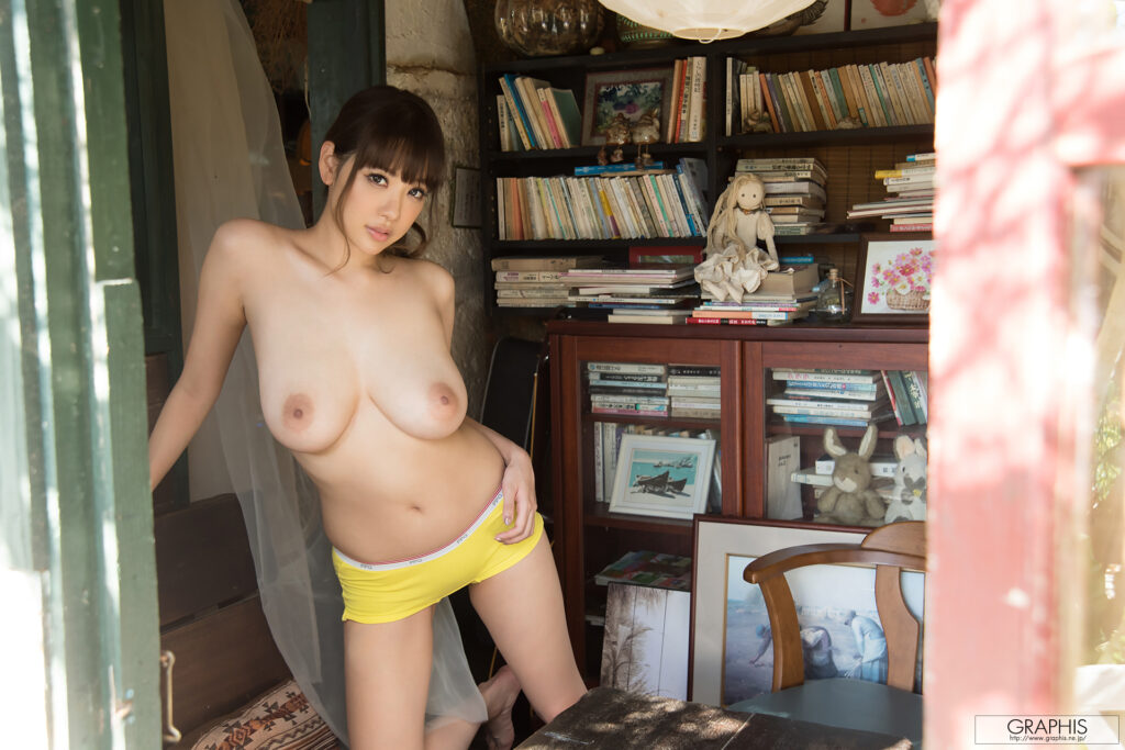
Right – The fourth shoot was, like the first shoot, a criminally short set with only a handful of photos. However, there were some nice shots that came of it. In this shot natural lighting is once again used as the primary means of illuminating the shots, which does create a more balanced spread across the subjects. Here we have Rion posing topless in what looks like a study or office of sorts, with plenty of books, stuffed animals, furniture, and all manner of additional items spread throughout. The shot has some visual scale as the camera is placed at the entrance to the room with the door frame being in the foreground. This adds not only context to the setting, but it also helps box in the shoot, further reinforcing the idea that the image is confined to a specific area. There isn’t an entire room worth of additional angles and set pieces to use. Color gradient is a bit mixed due to the various colors on the books and other items, but it isn’t saturated, so it works. Focusing on Rion, her yellow shorts are incredibly bright, likely the first thing one sees upon looking at the photo. Rion herself has her hair tied up to show off more of her figure and it certainly is front and center in this shot.
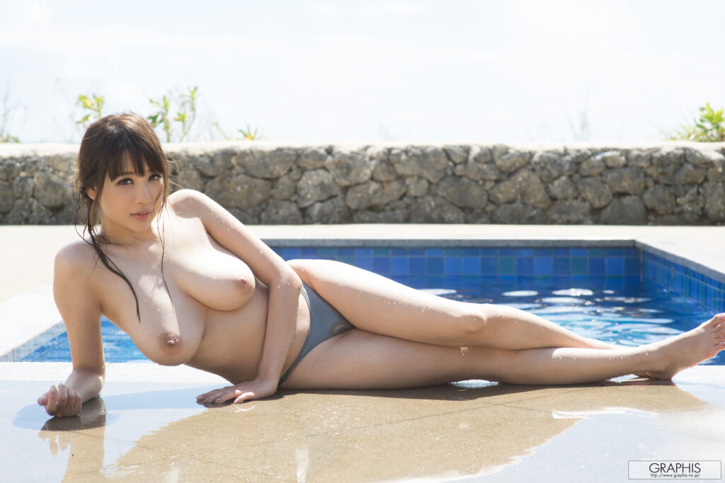

Left – Now we are getting into the highlight shoot of the album. This shoot has a lot going for it in terms of visual quality, not to mention the best shot of the entire album (and one of Rion’s best photos, period). Rion is once again topless, this time laying in front of a pool in the afternoon sun. Focusing on Rion first, she looks great. Her pose is almost centered with the pool, and she just came out of the water, giving her skin that glistening sparkle as the water droplets form and streak down her legs and chest (with some puddling at the bottom of her right breast). The water reflection on the stone floor helps reflect not only a mirrored image but also helps to define the shadow lines. The lighting was toned down quite a bit for this shot given the blown-out portions at the top of the image. The sun is behind Rion, and this helps create a dynamic lighting and shadow pattern along her body, in addition to adding some reflections on the water in the background. Rion, maintaining her previous hairstyle, is wearing a semi-reflective bikini bottom, which, perhaps on purpose, has a change in color when it is creased. This had the result of drawing my attention to this position, but perhaps that is just a coincidence. The shot is well done, nothing is oversaturated, lighting is well controlled, and the pose provides a great canvas for the water to add additional detail, although perhaps Rion could have done something different with her right hand.
Right – Throughout most of this album, Rion largely avoided taking shots that were either fully nude or shots that focused on her vaginal area. The reason for why is unknown, especially considering Rion also performs in pornographic films. In this shot the aforementioned areas are covered by the bikini from the outdoor pool shoot, only slightly undone and pulled off to the side. There isn’t much that is special about that portion, the shot is more significant for creating another angle to show off Rion’s breasts. Rion has moved indoors onto a mattress, with blinds serving to reduce the impact of the exterior lighting. Her hair is down and creates a flowing color pattern from the window frame up to her head. The highlight of the shot, and placed closer to the center, is that of her breasts, which in this position have been allowed to free hang, revealing the upward curve. Overall, there isn’t too much that is special about this image, I need an eighth and it displayed a different angle for which to appreciate Rion’s form.

Left – On to the last landscape images. First is a close shot of Rion on a bed with a very well manipulated natural light source. The detail and highlights are well done with a split in focus being Rion’s face on the left and her breasts on the right. The light coming through a gap in the room curtains creates visual depth by adding profile to the breasts, as evident with the left breast being both held up by the arm and allowing for the creases to be defined by the changes in light, whereas the right breast is left to fall wherever it may. Color grading on the image is soft, with the dress top falling in line with the color of Rion’s skin and acting as a bridge between her darker complexion and the parts exposed to the sunlight. Rion’s hair is messier, helping to fill out the frame but also providing enough of a contrasting color to prevent a wash out of yellow tan shades. The hair is also specifically placed in certain areas to reduce color and pattern bleed such as in the bottom left where the shoulder portion of the dress is restricted from meshing with the bedding. Rion’s facial expression also gets some attention. Rion is often viewed as being somewhat bland when it comes to reactive expressions, and so it takes some work to frame her attractive looks in a manner that brings out some life, and this almost sultry innocent look does work in her favor.
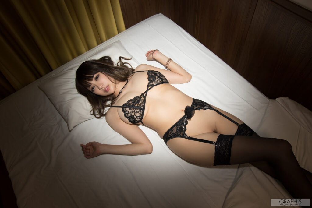
Right – Finally, the nighttime dark room shoot. Nearly every album has one, and they are some of the more hit and miss shoots due to lighting being of utmost importance to get right. Many models can look great in the dark but if the light is too bright or too focused, it can create some unsightly angles. In this case, it turned out well. Rion is laying on an all-white bed while wearing a typical lingerie setup (even without underwear, by the goddess!). The lighting focus is clear as day, focused just above Rion in a circular pattern. This leads to an earthy color palette as the drapes and walls are lit and contrast with the bright white mattress. Rion herself is laying on the bed in a common pose, with her hair spread out a bit and the legs being used to cover the vaginal region since that’s banned and all. However, if you look closely, you can make out the smallest evidence of some hair, which, as has been mentioned before, can and is used to break up patterns. The bush strip adds definition to the pelvic portion of Rion and helps prevent the area from looking like the stomach which naturally lacks detail as its a smoother portion of the body. Overall, a solid pose and usage of lighting in a directed manner, it forces the viewer to look exactly where it wants and reduces the influence of the surrounding area that is wasted space.
Portrait Photos

Left – Going back to the first indoor shoot of the album we have Rion posing in front of the window that was only briefly visible in the previous image from this set. In terms of setting the room is quite dynamic with a variety of geometric shapes and patterns in the windows, a color gradient that is linear, only being interrupted by the colorful ensemble worn by Rion. Speaking of the attire, from a detail perspective the floral patterns offer a nice amount of visual diversity from the otherwise straight lines present in the surrounding. In addition, the pink underwear is just the rid shade and intensity that it does not overpower the scene, nor does it get lost in the more chaotic color patterns of the dress. The bra in combination with a defined cleavage serves as a primary focal point for the photo and likely the first thing viewers will notice. The lighting is disrupted in its pathing by Rion standing in the corner, preventing the offside wall from receiving much illumination, thus focusing most of the light on Rion and the space around the primary window. A well-done photo that would be impossible to do in landscape because the scale would be off and the lighting would be more difficult to direct, especially since it is natural.
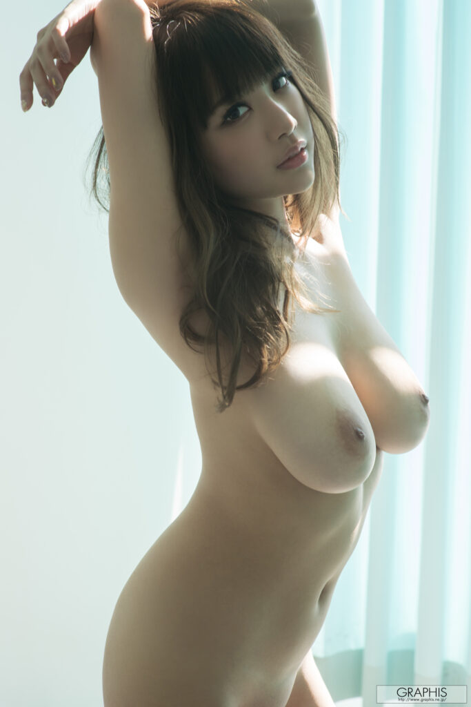
Right – The next shot is one that emphasizes length as the focus is close and stretch. Rion is scaled in a manner that ensures she is the primary item in the shot. Even the background is muted with a plain wall and drapes that are whited out through natural lighting and paint. Rion’s S-curve figure is front and center, and the reflection of the lighting helps to add definition to her body, with her arms being held back to emphasize her assets and form. The small glances of sunlight on her breasts add a contrast to a body that is largely in the shadow, this brings visual attention straight to that point as inconsistencies are an attractive feature to focus on. The same can be said for Rion’s hair. While one could say that’s just an attractive position to place the hair as Rion has a healthy amount that is worth displaying. It can serve as a visual break. This is something mentioned previously but essentially the idea is to add detail in whatever form in particular positions to add visual depth and prevent a runoff of similar patterns and colors. This method is not employed all the time of course, because for some shots you want an uninterrupted pattern, but in the case of this shot, the setting and colors are already minimalist, and so adding a little variation serves to bring out the subject of the photo. A simple yet well done shot.

Left – Now we are entering top tier level in terms of this album. Starting off we have Rion’s first outfit before the pool. This is an excellent shot for a variety of reasons. First, the saturation and brightness are on point. The vibrant green plants in the foreground, the subdued blue ocean in the distance, the balancing of Rion’s white bikini with the often-blinding stone walkway. The lighting isn’t blown out, of course a shade was used to reduce the impact of the light, otherwise the noise would be impossible to deal with, as seen by Rion’s elbow being lit up. Rion’s outfit is outstanding, her best selection from the album, sadly it only received a handful of shots. The wavy patterns across the breasts that link to the bottom piece is visually distinct. Rather than populating the scene with more colors, the choice to go with white was an excellent one as it makes the scene less busy color wise but helps add additional detail to Rion. Of course, another major factor in this shot’s favor is Rion’s smile. Rion is an attractive lady, but she often isn’t very expressive, and it is nice to see a little bit of a personality coming out of her shots aside from the more “sexy/sultry” look many of her other shots convey. It makes the shot livelier and full of energy, as a sunny pool shot should be.
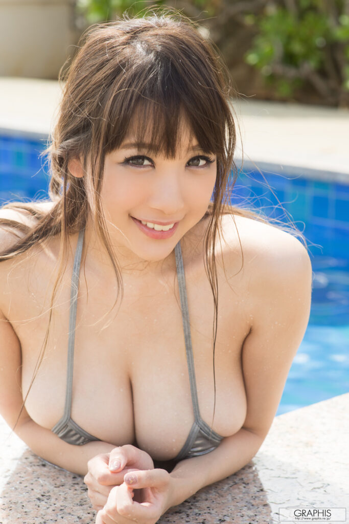
Right – This is it, the best shot of the album and one of Rion’s best pictures ever taken. Getting the elephant in the room out of the way. Rion looks outstanding. Her hair is tied back but wet strips are hung in various positions across her shoulders and flanking her cleavage. The bikini looks basic, but it works for the shot as the primary focus is Rion’s face. That smile ensured this shoot would be remembered. The personality and the energy displayed in this shot is akin to a blue moon for Rion fans. Rion is visually an attractive woman and is often placed in shots that emphasize either her bountiful assets or pull off a sexy pose of sorts, however, she often doesn’t express herself in an energetic manner. This restricts the types of shoots she can be used in and earns her a particular reputation among fans of the genre. Here, however, Rion’s smile, and personality is a welcome sight so see. A side where most would think Rion was incapable. The rest of the shot is good, nothing particularly amazing, good color saturation in the blue water and background plants, the lighting is well tapered with the sun to Rion’s back. The focus of this shot was Rion, the real Rion. An excellent photograph, well made, and deserving of being the poster shot for the album.
Summary
This album had many excellent shots and some great sets. Some were a little rushed, which is unfortunate, but the result was still a well produced work. Rion was able to come more into her own in some of the shoots, which was a great addition to the personality and overall feel of the album, especially for those that have tired of seeing someone as attractive as Rion often displaying a rather muted personality on camera. The interior sets were well designed with solid lighting and color control, and the exterior shots, often the most difficult to do as the sun doesn’t exactly cooperate, were also a solid production. The color and tone of this album often falls into a comfort zone where the patterns and visual queues are similar or in the same vein, such as using the same set for different shoots. However, there is enough of a break with some very colorful exterior shoots to help offset the less energetic interior sets. I highly recommend this album for Rion fans (and fans of gravure modelling in general), especially with the BTS video portion that adds some extra life to the production.
Score: 8/10
Pros
– Rion’s smile
– Varied shoots with plenty of outfits and styles
– Video version does have a BTS component
Cons
– Too many shoots meant little time spent on certain sets
– Some angles are not quite doing Rion any favors
