Graphis: Airi Suzumura

Actress: Airi Suzumura (23)
Studio: Graphis
Release Date: 2017-01-06
Runtime: 25 Minutes
Introduction
Note: Graphis shoots tend to have very little in the way of videos for their shoots, as such most of their reviews will be focused on the photography aspect. In addition, the ratings will be lower for the video portions largely due to a lack of material in comparison to other IVs.
Production & Setting
Score: 7/10 (Production), 7/10 (Setting)

Music
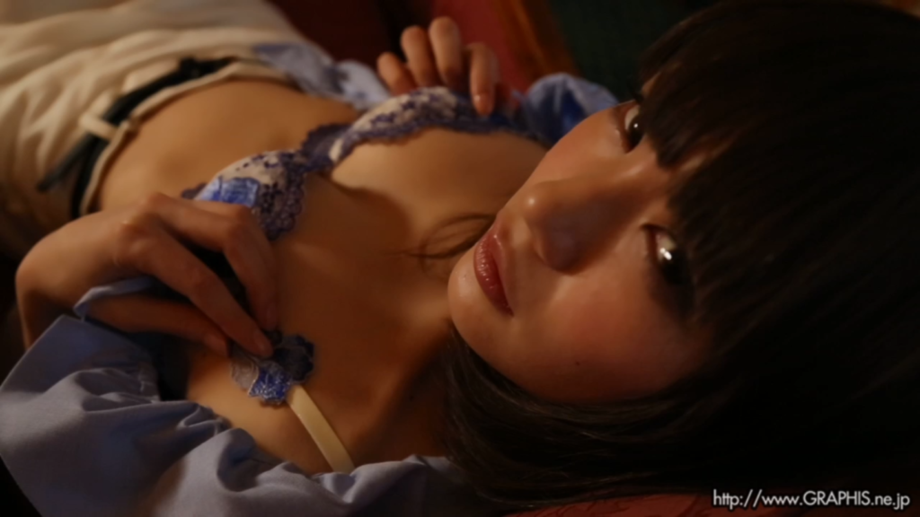
The music is basically only present in two scenes, granted there are only like two scenes of actual Gravure content. The music from both shoots was well done, shifting themes once in each as the scenes progressed. The first scene has two sets of music, the first track is an upbeat percussion heavy track with some added string sounds that serve to make the track (and by extension the scene) appear grander and more exploratory in nature. This shifts to a deeper sound in the second track that is full of depth, something you’d see playing in the background of some epic and somber moment in a fantasy film. It works for the most part as Airi is something of a spectacle herself. The track takes a step back during the finale to do a slow climb of instrumentals with a nice echo effect from the percussion line before it is joined by a very prominent orchestral ensemble that then fades away as Airi takes her final pose. It’s a little abrupt and could have used a bit more time to draw out the song but it works.
The second scene starts off with an interesting combination of a percussion flute duet and some electronic beats that sound very 1990’s nighttime joy riding to me. The music maintains a good tempo throughout and works very well with the aesthetic of the scene and with Airi’s movements. As the scene moves to a more intimate display between the camera and Airi, the music brings the treble percussion up front and center in a more noticeable position and gives off that sultry vibe the scene is attempting to convey. This track has a nicer fade away but that is largely due to being less grand in it’s personality to begin with. The last two scenes don’t really have any music to speak of which is fine given their context and runtime. There is a light electronic track at the start of the BTS portion that sounds like it belongs in a Nintendo Wii menu, but that doesn’t last too long before the talking portions of the video start and the music is removed.
Score: 7/10


Aesthetics & Performance
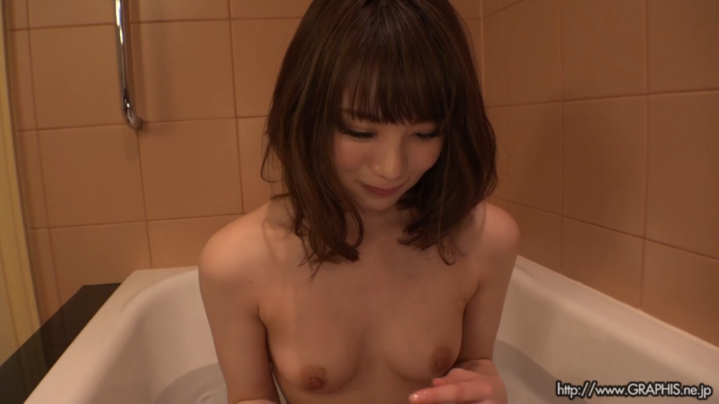
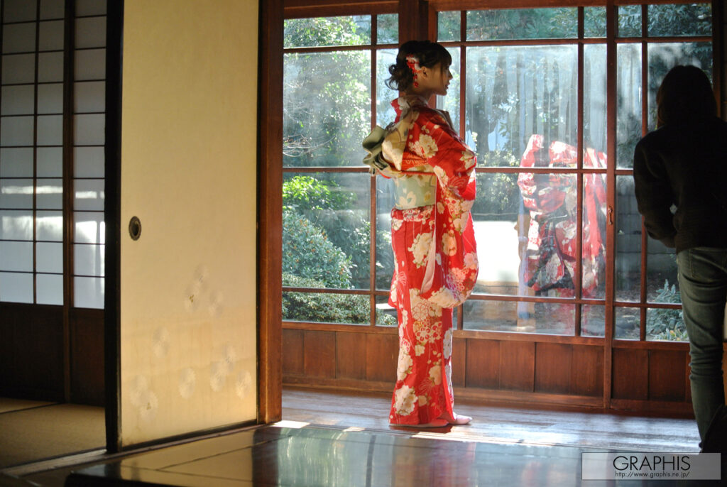
Discounting the BTS content, aesthetically Airi looks great in pretty much any of the shots in these scenes and the setting while being a generally basic hotel bedroom backdrop excels due to a very well-balanced composition of lighting and colors. The lighting is soft throughout thanks to a prevalent usage of yellow lighting and darker browns to round out the palette, creating an amber hue to the palette. This served to tint and filter out the potentially polarizing colors from Airi’s lingerie in the second scene and serve as a contrasting element to the subdued natural lighting present in the first. The vibrant colors used in Airi’s bra for the first scene served as a good counter to what could have resulted in a muted color display. Airi herself is great visually, her hair is done in a manner that suits the hotel date persona I think they were going for and her outfits compliment her figure very well, especially the lingerie in the second scene. The bathtub scene visually looks nice but it’s basically just Airi in a bathtub, which isn’t a problem, just that there isn’t much going on visually. BTS side note: where is my kimono scene?
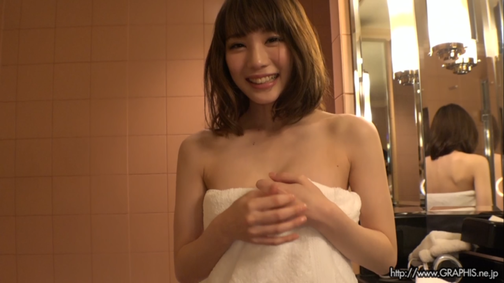
Airi performs well within the scenes, her expressions are on point and her movements are in line with atmosphere the scenes are trying to convey. She plays the sultry date really well and while her BTS content is her being bubbly and entertaining, that still counts to show that she is comfortable with the settings she finds herself in and when needed to play a role she can do so. Airi’s body does most of the acting throughout the shoot, however, her facial expressions are very animated and are an example of someone that has full command and presence within the context of the artistic direction. Most of Airi’s performance during this shoot is primarily focused in the photography side, however, she does not disappoint in the video portions despite their shortness. Had this been a full length IV then she likely would have been able to show off something great.
Score: 7.5/10 (Aesthetics), 7/10 (Performance)
Photography
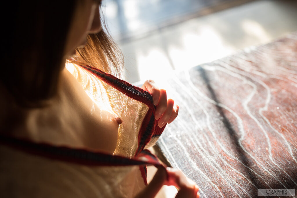

Left – To start off the review we have a closeup shot of Airi’s left breast. This shot has a lot going on with it. First is the mixed focus aspect of the shot, where Airi’s hand, sweater, and breast are the primary actors of the shot, with the surrounding environment consisting of the table, the floor, and the rest of Airi playing the supporting elements. Lighting in this shot is created from natural lighting coming through the semitransparent wall panels. This light is focused primarily on the table and its immediate vicinity, Airi. The light itself reflects off the table and surrounding area to light the shot as expected, however, to add additional impact with the lighting and the shadows it creates, Airi opens her sweater in a manner that allows light to shine on her chest. The pattern of the fabric creates a different effect as the light bleeds through, this creates a more dynamic variety of light and shadow in the breast region, as evident by how the nipple is obscured by shadow and then as you move up the chest there are different visual patterns as the light figures out where to go. The color grading is fairly seamless as well, choosing to go with a brown palette that serves as a baseline to reduce the vibrancy of Airi’s hair color, which itself has the potential to become a large visual element, however, it was not the focus of the shot and so it’s potential to overwhelm the shot is subdued. The outfit is also shot in a manner that helps prevent a white out effect by creating a dark barrier between the bright floor in the background and Airi’s skin. This all serves to draw the visual focus towards the breast, everything else is a supporting element and used for scale or for visual depth.
Right – The next image is a wider shot of the same room, evident here are the same visual elements from the prior, such as the focused light through the wall and the table being used as a reflective surface. The shot is focused on a wider frame of Airi’s backside as she proceeds to undress. The color and content of the background to the left of Airi is there to add additional color grading and scale to the image, however, the table leg on the right is an important actor to the purposes of this shot. While the focus is certainly on Airi’s backside, the soft shadows on her butt and the blinding light that is eating away at the detail of her right leg is a result of the reflection off the leg and filling that section of the photo with shadows and light. The upper part of Airi’s waist and butt is illuminated by the light coming off her sweater sleeve, but by creating a barrier between the leg of the table and Airi’s leg, light is forced to move upward as seen by the dark shadows just past her foot. This shot is more complex due to the various colors and visual elements, such as the white underwear serving as a color block by preventing the color palette of the room from rendering the butt too subdued in its presentation. The same can be said about the shorts which are used as a light block, causing the rays to find a different source to reflect as denim tends to prevent such a glare, this helps ensure the legs don’t get whited out and only the small portion of the leg gets that treatment.
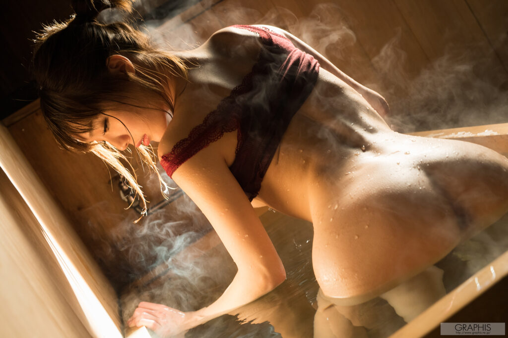
Left – Outstanding, almost visual perfection, this shot is that good. There is a lot to break down here. First, the color palette, sticking with the browns and greens offset with natural lighting that causes a yellowish hue to form. The colors are in the right spot, nothing is oversaturated or contrasting in a negative manner. From Airi’s hair experiencing at least three different tones to the color of the tub siding and the water taking on some of these colors via reflection. Airi’s dress also adds a nice touch of red color to the scene and serves as a bit of a potential reflective break from any glare from the back that could be made, but its likely there for the color and visual dynamic than anything else. The lighting is used to a stunning degree of accuracy, especially when you consider how it looks in the BTS video. The light is allowed through a slit in the curtain to focus as a glancing shot off the left side of Airi, being blocked by her arm, and then hitting her backside before going off into the distance. Airi takes on her side pose which is prominent throughout this shoot, this serves a couple purposes, first, it prevents the model’s face from being the central focus of the shot, allowing it to be more in tune as a team player. Human faces have a lot of nuance and features to them that can say a thousand words depending on the shot, so it would just get in the way of certain pictures to have the face fully visible. Airi’s pose is her arching her back as she is stepping out of the bath and is framed in the shot at an angle to create a high shot perspective with the additional backdrop elements to flesh it out.
Of course, probably the most dynamic feature of this shot is the water. The water is present in three forms, the pool of water Airi is standing in, the steam coming off of Airi and the pool, and the water running off Airi. The water by association is also serving a few functions, one, as a reflective surface to direct light and add depth via the mirrored imaged of Airi, and second, to add depth and complexity to the scene through the vapors diffusing light and becoming white as a result and adding a dimension to Airi by following body lines as the droplets run off her backside and arms. This is a tough shot to take, especially one where the vapors are all in the ideal positions, such as between Airi and the light source, or obscuring the butthole, or bringing more form to her upper shoulder area.
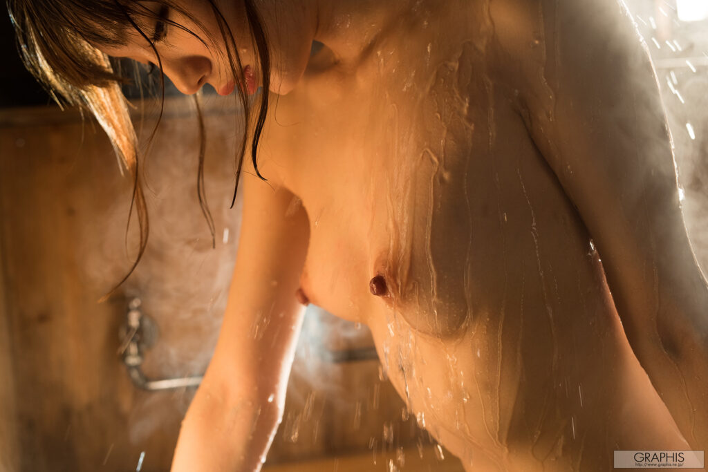
Right – The next shot is done against the same color palette and backdrop, however, the lighting is adjusted towards the back to create some dynamic shadows and outline the physical limits to Airi and as such create a visual barrier in addition to the other elements light creates. The primary focus of this shot is of Airi’s chest as it’s relatively in the middle of the frame, with Airi’s face in the top left creating the scale and the perception of upwards movement. This is a moving shot as evident by the water running down from above Airi. The detail in the water is a standout feature of excellent camera work as the faster moving water is difficult to shoot as seen by some out of focus droplets. Once again as in the prior shot the water vapors and steam play a part by acting as light diffusers and outlining some of Airi’s form. Overall, this was the best shoot of the release and even if it had a video component it would be tough to outperform these photos.
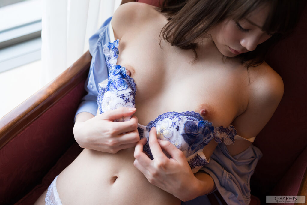
Left – These photos are from the first shoot featured in the video portion of the release, albeit significantly brighter in its lighting and color palette. Whereas in the video the lighting was reduced in order to create a sultrier atmosphere, these pictures send a different message due to these changes. Starting with the first image, the continued theme of using side angle shots of Airi’s face is present and is partially obscured by the darker background, lending to the idea that the bra, hands, and slowly revealing chest are the central focus to the shot. Lighting from the window is used once again to illuminate Airi’s body, add depth via shadows around her breasts, hands, and more distant portions such as her left arm. The color palette is softer, with brown serving as the foundation in the background but the foreground is brightly colored skin tone mixed with the blue/purple bra and dress that help bridge the gap between being too light or dark. Overall, a very different tone is intended by having the shot so brightly lit, it brings about a more casual exploratory tone in contrast to the more seductive affair presented in the video adaptation.
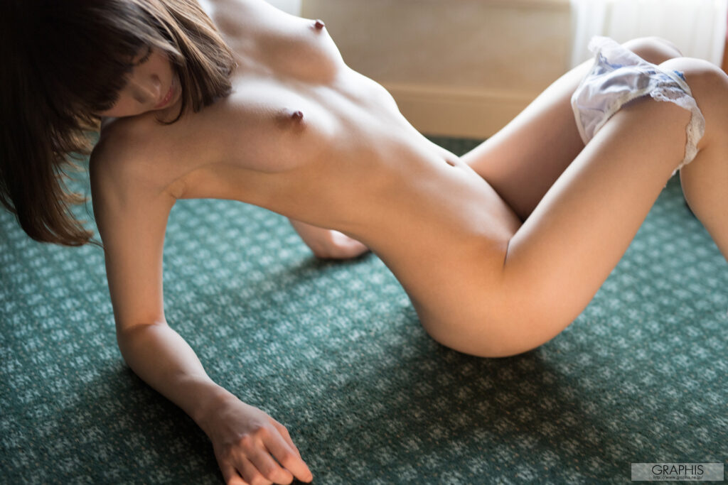
Right – The next shot is in the same room, but it has moved to a floor pose with only the panties serving as the clothing article of choice. This is a much larger scale almost full body shot. The angled pose does make the body look more dynamic and in motion to an extent. It probably sounds like it is mentioned too much, but lighting is a major component in determining the personality and objective of a shot. The light here is projected from the window which is now at a high angle and this creates a different lighting and shadow effect on Airi’s body. The body lines receive more detail as the light reflects off the legs, chest, including breasts to an uneven extent, and Airi’s abdomen. Airi’s hair and her overall angled pose prevent the light from fully reaching her right side although a sliver reaches her arms from below. The colors present in this scene are very minimal, natural skin tone is only complimented by a rather muted floor color and the panties do offer a bit of color, but they appear to serve more like a barrier for the legs, since the shot is cut just after the knees its often better to create a visual barrier for the viewer as some elements of a shot are there for secondary purposes and the viewer should not be focusing on drawing out where the rest of the legs go.

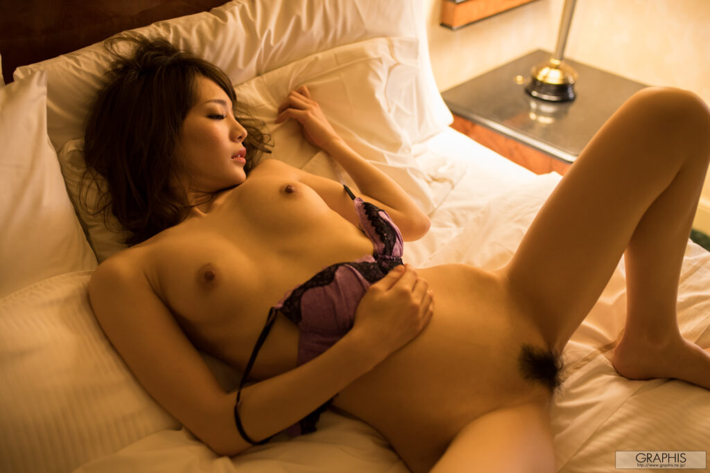
Left – The final shoot takes place in the bedroom in the evening and thus the lighting is entirely artificial. The shoot has a yellow hue and tone to it, due in part to the lighting but also to the tan wallpaper and the brown mantle. The sheets amplify this coloration as being white allows them to reflect the lighting. Airi in this shot is taking a side pose where her face is now front and center. The shot has good focus and headroom throughout. The backdrop is out of focus just slightly and the viewer is drawn into the center with Airi’s face and upper body. The only elements that contrast the shot is the vibrant bra that despite being filtered is still so saturated that the pinkish hue stands out. This is good as once again besides adding detail it serves as a visual cue for the viewer to be drawn right to it, it also acts as a color break to prevent the scene from becoming washed out with one gradient. Airi’s hair is a bit messier, likely trying to convey the idea that this is the nighttime fun time portion of a date, and Airi’s facial expression is pointing towards a more seductive direction while remaining to some extent innocent in demeanor.
Right – The next shot is split between a lighter and darker side as the light source is coming from one direction. This adds soft shadows across the set, from the sheets and pillows attaining more detail in all their creases as a result, to Airi having more defined lines appear across her body. The lighting is weak enough that it creates more of a shadow gradient across these portions instead of the usual light dark contrast seen in brighter shots. Once again, the bra is in the middle of the shot, acting as a color break and drawing the viewer in. Airi’s pose is now far more revealing and potentially sexual in nature, with her head off to the side, one hand lightly grabbing the pillow, and her legs spread wide with no attempts to hide her prominent bush. The panties didn’t even get a send-off shot; they just went to the shadow realm in exchange for a bush shot. Of note regarding Airi’s bush, while it certainly can be construed as a being a component of a more sexually charged photo, it also doubles as one of those visual breaks by providing a color contrast and attractor. Had Airi been shaved, the first impact to the artistic integrity of the shot would have been a body skin tone color flow that blended in with the backdrop too much, rendering any sort of dimension and depth to that part of Airi’s body moot. By having a bush displayed so prominently it helps to disrupt this potential problem, while also adding more actors to the scene and likely drawing some viewers in as well. Of course, had the bush not been there at all then the photo likely would not have been taken because censors would have been required and that would ruin the shot in its current form.
Summary
The video portion of this shoot was unfortunately short, and while the BTS components were more than welcome and always a nice addition to any Gravure production, there just wasn’t a ton of content to view or savor in this release. Airi is a solid performer in Gravure and in JAV, but this was more a small teaser than anything else. However, despite how little content there actually was, it still was done very well and had it been a full film release it likely would have been one of the better releases done by a Gravure studio, especially when taking into account the quality of the photoshoots, a couple of which were some of the best model photography I have seen come out of Graphis or any other studio. Photography wise, excellent, top tier in many respects. The spa photoshoot was easily an 11/10 if such a rating existed it was that good. The photoshoot does taper off a bit towards the latter half of the set pieces but the first two were excellent in their usage of lighting, water, and color. Just an outstanding aesthetic presentation and presence in many of those photos. A highly recommended photoshoot to look at if you are a fan of Airi or of model photography in general.
Score: 7.1/10 (Video), 8.5/10 (Photo)
Pros
– Videos are well done, good outfit and acting
– BTS content is always a welcome addition
– The spa photoshoot is amazing (Photography)
Cons
– Not a lot of content overall
– Where is the kimono?
